

Swift was featured in a series which ran in the early fifties in a British comic paper. It was created and drawn by artist Denis McLoughlin, assisted by his brother, Colin, who scripted.
McLoughlin was an artist who drew in a style influenced by Americans. He was a prolific cover artist for UK editions of American and British crime and mystery novels. He also did pulp magazines (covers and interior illos) and comic books. His career,which ended by suicide in 2002, was capped by twenty years of drawing the UK Commando series. I bought the book, The Art of Denis McLoughlin by David Ashford. I am impressed by the quality of this artist's output in a combination autobiography, biography and illustrated catalog of his work.
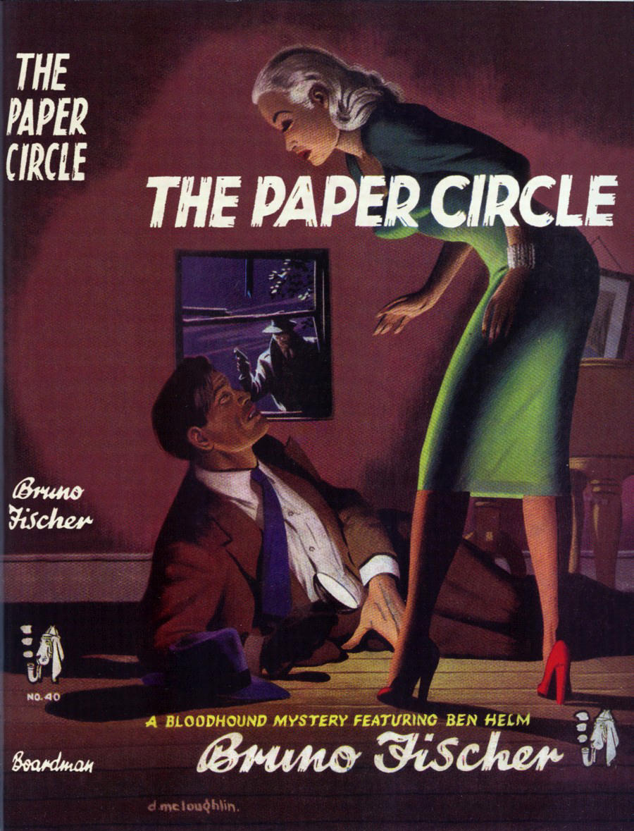
I found the story online, reproduced from a black line comic interior. The color (sorry, I mean “colour”) cover is scanned from the The Art of Denis McLoughlin. (More below the story.)


The book I am refering to is a 950 copy limited edition, which I found available from a third party seller on Amazon.com, at a very reasonable price.
The prolific McLoughlin was also well known for his Western illustrations. He was fascinated by the subject, and had a large reference library at his home .

Here are a couple of his cover illustrations from the book, which show his versatility in style and subject matter. I especially like his moody, noir-styled illustrations in deep shadows. He drew some beautiful women, too...a must for pulps and paperbacks.

5 comments:
I quite liked the cover of this issue — craft of the sort that Frank R. Paul might have designed; inking in the style of '30s interior pulp art; fun machine-age lettering; and bright, simple colors.
The interior art is not nearly so elegant, but it's much less stiff and dull than the typical art of quasi-realistic British comic books of that era. In terms of the visuals, what is most disappointing to me is the lettering for narration and for dialogue. They'd have done far better either to get a more skilled letterer or to use a guided-lettering set.
It doesn't make me feel jovial to read “Jupitan” for an inhabitant of Jupiter. And, speaking of “-tan”, calling a tan got on Mars a “spacetan” is an unhappy example of the absurd “space-” prefixing to which you objected a few entries ago. Same d_mn'd sun to damage the skin.
Earth culture will have made great strides when it welcomes refugees from other planets; right now, it seems that the publics of many nations offer the reins of power to those who would send other Terrans back to their home jurisdictions, even after ruining life in those other jurisdictions with foolish interventions.
Well, it looks like you showed us another cool cat.
Neat space opera. Looking at those aliens, first impression is that he's only a few steps from a Steve Ditko mood. The humans are more conventional, though.
Those heavy lines of light-and- dark contrast in the backgrounds are so british to me... when did he made this story? The backgrounds remind me of the early Jeff Hawke strips.
The overall feeling is "Steve Ditko meets Sidney Jordan". This is only emotional, not a rational opinion.
ANOTHER cool comic artist commits suicide? I'm beginning to wonder if there's any connection with the job...
P.S.: Congratulations for the 700 followers :)
J D, thanks, but the credit goes to those 700 for not dropping out (it happens sometimes...so the number can fluctuate).
I'm not sure on the dates, early fifties if I remember correctly.
Daniel, the lettering is done by the artist, and he was actually a talented display letterer, as you can see by the book covers. I think they probably needed the heavy lettering due to the poor quality of some of the printing. Even worse than American in some cases.
"Spacetan" and those other space-prefixed words sound straight out of the Jetsons. Although a "tan" is commonly referred to as a suntan (sunburn also...but I don't remember reading "spaceburn" anywhere).
Hi Pappy,
See http://www.comics.org/issue/10388/
The indexer has assigned a date of March 1953 for these two stories (probably from some external on-sale data).
I'm glad Silver is present, so it's not just spaceMEN. Too bad she's just a hostess on the space liner.
Post a Comment