Saturday, September 30, 2006


Number 31


COVERING IT: Classic Covers From The Golden Age Of Comics


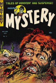
My buddies and I were a morbid little gang. As kids we did a lot of talking, and at times we'd discuss the worst ways to die. My neighbor, Allen Arnoldson, told me the story of some poor guy buried up to his neck in the dirt. Honey was poured over his head and he was eaten by ants! That is one story I never forgot, and even had nightmares about.

Now I'm a morbid adult. Mister Mystery #11, dated May-June, 1953, is a horror comic with a cover showing a guy in that awful nightmare situation.

Bernard Baily (1916-1996) was the artist. He had started work for DC Comics in the late '30s, and drew The Spectre for them. His art style got slicker as time went on, but his subject matter got a lot more gruesome. Mister Mystery had some lousy contents, with the exception of some stories by Basil Wolverton, but the covers were about as good as horror comics ever got.

The prices these comics get in today's market is way out of my reach, so I took this off the Internet.

Friday, September 29, 2006


Number 30


Frankenstein Friday: Frankenstein and the Manimals

This is the last story from Frankenstein Comics #1 by Dick Briefer, from 1945.

In an already bizarre comic book, this story is even more bizarre than the rest. The "manimals" could be inspired by the animal-human creatures of H. G. Wells' classic, The Island Of Dr. Moreau, which has been made into a movie several times.


 Next Friday: Joe Maneely's Your Name Is Frankenstein! 

Wednesday, September 27, 2006


Number 29


Golden Lad and the League of 1965 

At the end of World War II, the idea of a United Nations, something that was hoped would prevent the type of war just ended, was being established. Some people found the idea threatening, considering it part of a "world government," a plot to replace our national government. You still meet people who believe that.

This story is really pretty simple; too simple. Some kids have a "League of 1965," which promotes the idea of a world organization (unnamed, but most likely the United Nations). Some crooked newspaper editor wants to squash it by telling lies about it. Golden Lad helps the kids, the editor is exposed, a congressman votes for the world organization, end of story.

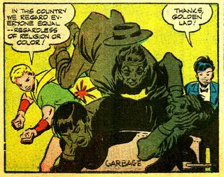
In the story Golden Lad helps a Jewish boy who is assaulted by some men. Talking about racial equality in those days was enough to get you in trouble with a strong contingent in Congress, which even at that time was fighting back any laws designed to help or give equal rights to racial minorities.

When Golden Boy beats up the bad guys and says we "regard everyone as equal regardless of religion or color," he's speaking to an ideal which wasn't realized by a long shot. Many states segregated their citizens by race, and discrimination based on religion and race was not only common but accepted. Golden Boy must have been speaking of the way he personally felt, not how things really were in America at the time.

The story is overly simplified, but interesting because of its place in time and history.

The dates seem wrong. The kids all look to be 12 or so, and the premise of their League is that in 1965 they'll be the ages of the men fighting the current war. I hate to spoil their math, but the men who actually fought the real Vietnam war in 1965 were born years after the fictitious kids in the strip. It'd probably be more proper to call this The League Of 1955, but maybe that didn't have the futuristic ring of 1965, which at the end of World War II seemed very far away.


This story came from Golden Lad #3, 1946. I have it in the form of tear sheets. Years ago I was given a box of comic book stories, cut out of their original issues by a man who collected stories by his favorite artists. I reconstructed several of the stories that were complete, but after eliminating the stories with copyrighted characters like Batman and the stories that were too brittle for anything but the trash basket, I had a few stories that I could scan and post. It's also why there are chips out of many of the pages. They flaked away.

This story was drawn by Mort Meskin, an artist who worked for a long time in the comics industry. His sons have a wonderful website devoted to Meskin, which will give you further information. Meskin was a cartoonists' cartoonist, someone who influenced and mentored other artists without necessarily gaining a lot of fame for himself.

Forty-one years after the real year of 1965, and 61 years after the publication year, 1945, all of these ideas seem far away and very idealistic, but the fact is we're still fighting wars, and who's to say that idealism is wrong?


Monday, September 25, 2006


Number 28


COVERING IT: Classic Golden Age comics covers.

I can imagine the editorial conference that went on between editor and artist when this cover was dreamed up. "Al, I want some skeletons…two or three of 'em would be good. I need a girl chained to the wall, and a guy trying to get out who is being threatened by a skeleton coming out of a coffin. Oh yeah…try to work some spiders and lizards in there, too, would you?"

The "Al" the editor was talking to was Al Avison, one of the true workhorse artists of the Golden Age. He worked with Simon and Kirby on Captain America at Timely, then helped Syd Shores draw it when Simon and Kirby left to go to DC. He worked for various companies, but found his home at Harvey Comics, where he did a lot of stories, and a lot of covers. He could channel various artists, like Jack Kirby, Chester Gould, Ham Fisher, and so usually did the covers for issues of Dick Tracy or Joe Palooka when not doing a Kirbyesque Boy Heroes in All-New Comics.

He did some fine horror comics, too, including this gem of a cover from Harvey's Chamber Of Chills #7,, dated April, 1952. One of the story titles on the cover, "Pit Of The Damned," would perfectly describe this illustration. If that isn't the damndest pit I've ever seen, I don't know what is.

I don't own this book. I found this picture on the Internet, and even though I thought I'd seen every cover of every Harvey horror comic I hadn't seen this one. It's eerie, with lots of elements that would seem really cool to a young boy picking it off the rack at the newsstand. "Wow! One of those skeletons has a knife through its skull! That is neat-o!"

This looks a lot like the sort of thing a young teenage boy might draw in his school notebook while sitting through another boring algebra class. In those days if the teacher saw it it probably wouldn't raise an eyebrow. He'd just think, "This kid reads too many comic books." Nowadays if a kid drew that picture and someone saw it he'd be in for a visit with a shrink. They'd think they had a potential serial killer on their hands.

Even for a 1952 horror comic this was pretty heady stuff, but if you look past the subject matter at the composition the elements are arranged in a pleasing way, and as with other Avison covers, there is so much going on that it is a classic of the era and of the genre.

Friday, September 22, 2006


Number 27

Frankenstein Friday: Frankenstein's Wife

This is the third story from Frankenstein Comics #1 from 1945, written and drawn by Dick Briefer.

The first two stories from the issue can be found in Pappy's Number 20 and Number 23.

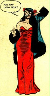
This is a weird story--well, all of these Briefer Frankenstein stories are pretty weird--but this is weird even for Frankenstein, because sex rears its head. It's not explicit, just implied, but the statuesque, and toothsome Mrs. Frankenstein has some sort of sex appeal. Even more when the society gentlemen think she has $4,000,000.

Briefer was being original when he designed Mrs. Frankenstein (and no, she's not assigned a name except for that…something that Briefer did with supporting characters in many of his stories), because he didn't use the famous Elsa Lanchester Bride Of Frankenstein image to caricature. Rather than the beehive with lightning bolt design on The Bride's coiffure, Briefer put a Bettie Page hairdo on her head. You have to admit, Mrs. Frankenstein is pretty...ugh...unique.


I have read this story a couple of times over the years but I just noticed the note to the owner of the company Mrs. Frankenstein is quitting. The owner's name is W. C. Bowl, which would be Water Closet Bowl, or to us Yanks, Toilet Bowl. OK, it's not much of a joke, and its origin is probably in the experiences American GI's had in Britain during the war, but it must've appealed to Briefer's strange sense of humor.

Next week: Frankenstein and the Manimals!


Wednesday, September 20, 2006


Number 26


Ron Haydock's Sky Bird #1


Every once in a while I'll be departing from my usual Golden Age comics format to show you something from the fanzine days. I was on a comp list and used to get things like Sky Bird #1, posted here. They'd show up in my mailbox, and not many of them survived the periodic purges of my basement.

It's not strictly comics related, but I'll justify posting this by saying that Flash Gordon, the King Features comic strip of the 1930s by the artist, Alex Raymond, was the inspiration for not only the movie serial, but also influenced many of the earliest comic book artists of the golden age. How's that?

Science fiction and comic book fanzines, and especially the mimeo or ditto kind, were something like the Internet is today, only without the broad reach. I doubt Sky Bird #1 reached more than a hundred people, and probably more like fifty, which is about what a typical spirit duplicator stencil would last on a machine. What they were, more specifically, is freedom of speech. It was the right of anybody, anywhere, with access to a duplicator and a typewriter to make a stencil, to publish. That's what blogs are, many years later, just that sort of publishing, done in cyberspace instead of on 20-lb. duplicator paper. And of course, the potential to reach millions instead of a couple of dozen.

Author Sam Sherman takes an uncritical--what we used to call a "goshwow"--look at the old Flash Gordon serials, starring Buster Crabbe. Sherman lived in Hollywood and apparently knew Crabbe, who is quoted in this article.

Ron Haydock,who published this 4-page fanzine, was a very interesting character: rock singer, actor, writer. After his fanzine days he was the editor of a short-lived but entertaining magazine called Fantastic Monsters Of The Films.

By presenting this issue of Sky Bird, I'm giving it a potential audience unheard of by a fan editor in 1961, even someone who believed in the promise of a science fiction future like Flash Gordon's.


Monday, September 18, 2006


Number 25


Joe Kubert's "The Hog."


 Joe Kubert is a cartoonist and teacher, as well as being one of the best comic book artists of all time. He started young, about 13, as an apprentice and he learned his lessons well.

Off the top of my pointy head, I can think of some of the Golden Age comic book publishers he worked for: DC, Harvey, St. John, and Atlas. He even did a short stint at EC, working with Harvey Kurtzman.

This story, The Hog, is from Journey Into Mystery #21, January 1955. It was the second to last issue of the pre-code series, and the whole comic seems somewhat tamer than earlier issues. Maybe the censorship talk was affecting them, even before the Comics Code went into effect.

The Hog is Horror Comics 101, the most basic style of horror story published in those pre-code years. A bad guy performs bad acts, and gets an ironic fate, brought about by his misdeeds. This story stretches that with the most laughable ending I've read, and you'll see what I mean when you read it.

Where it's great, and worth looking at, is in the artwork and storytelling style of Joe Kubert. The splash panel is a masterpiece, showing one car cutting off another car on a road with an S-curve. We're immediately dropped into the premise of the story: the main character is a jerk, a road hog. He's what police nowadays euphemistically call an "aggressive driver." In this case the guy likes to make people crash because he wants to see them die. Kubert's layouts are varied, and he uses his long shots with as much effectiveness as his close-ups. The last page is straight out of the Harvey Kurtzman stylebook.

Look also for the road sign that says "Drive Carefully" or the billboard with the "Reduce Tension" line for its gum ad. I doubt these were scripted in, but put in by Kubert for further irony.

A lesser artist would have taken such a ridiculous story with the very silly ending and by lack of talent made the story completely unmemorable. It's to Kubert's credit that no matter what story he was given to draw he made it worth a long look.


Saturday, September 16, 2006


Number 24


COVERING IT: Classic Golden Age Comics covers, Part 7


After World War II Alex Schomburg went from drawing superheroes beating up our foreign enemies to beating up our domestic enemies. He drew some mighty sexy girls, too.

This cover of Black Terror #20 from 1947 is a great example of what I'd call the VaVa Voom factor; guys seeing this cover on the newsstand would just naturally reach for their dime. Sex appeal was great on post WWII covers, especially prevalent with the crime comics of the era, but also available on even the teenage titles like Al Feldstein's Junior or even the venerable Archie.

I have read some of the Black Terror stories, and frankly, the covers needed to be hot to sell those books.

Schomburg worked in a couple of different styles, ink and airbrush. He either signed his work with his real name or as Xela. No matter what medium he worked in, what his subject matter was, no matter what name he used his covers were extremely well drawn and eye-catching. This is probably one of his top sexy covers.

Friday, September 15, 2006


Number 23

Frankenstein Friday: Frankenstein And The Ghouls And Vampires.

"I want a ghoul, just like the ghoul, that buried dear old dad!" Ah, excuse me…just warbling a tune, Sinatra-style, in honor of this edition of Frankenstein Friday.

As promised, here is the second story from Frankenstein Comics #1, from 1945, written and drawn by Dick Briefer. As listed in The Overstreet Comic Book Price Guide, Frankenstein Comics #1 is noted for two things: The origin story and for the Sinatra parody, which appears in this story.

It isn't much of a parody, and the jokes surrounding the parody are pretty lame. As a matter of fact, the whole story is fairly lame, but Briefer's cartooning and bizarre sense of humor save it. Horror comics as we know them were still a couple of years away when Briefer drew this story, but his depictions of the ghouls and vampires could be slightly less cartoony and fit right in a horror story of the 1950s. In that way Briefer was ahead of his time.

In other news, Frankenstein's weight changes drastically in this story, thanks to a potion he creates, which I don't believe was ever seen again in any other Frankenstein story. The color of his coat on one page switches from blue to red from panel to panel. That wasn't Briefer's fault, since coloring for Golden Age comics was usually handled by an outside company and coloring inconsistencies abound in many titles. There were thousands of pages of comics published every month, hard for anyone not to make some mistakes.

Finally, I don't know if there was ever any other comic book story in which the bad guys were conquered by a belch.

NEXT WEEK: Frankenstein's Wife!